Rethinking Deutsche Bahn's mobile app: simplifying the four flows passengers actually use: booking, seat selection, live tracking and support.
DB's mobile app didn't match the quality of its rail network. We re-designed the four most-used flows around real passenger behaviour — and validated each with usability testing.
Steps to book a ticket
from 7 → 4 taps
Testers completed booking
vs. 2/5 in baseline
Flow unlocked pre-login
live status without account
Core flows redesigned
booking · seats · tracking · support
6 in-depth interviews and 14 survey responses revealed the same friction points — across commuters, tourists, and occasional riders.
6
User interviews
45 min each, semi-structured
14
Survey responses
Quant + open-ended feedback

"The seat map is a maze. I booked a window seat and ended up facing backwards with no outlet."
"I had to buy food on the train with cash because the app doesn't let you order ahead. In 2024."


"I use the app because I have to. If there was a decent alternative, I'd switch tomorrow."
The redesign focuses on reducing uncertainty at four critical touchpoints where users currently lack control/information.
Secure specific seat placement
Passengers struggle to select seats due to unclear layout, causing delays.

Plan food availability
Users cannot add meals during booking, resulting in incomplete trips.

Reach support during disruptions
During delays or cancellations, users cannot contact support directly within the app context for immediate assistance.
Track journey progress accurately
No replies to queries that require immediate attention.

Five stages, repeated twice. Each round narrowed the design and surfaced the next problem.
01
Empathise
6 user interviews
02
Define
pain points into 1 persona
03
Ideate
Crazy-8s, voted top 3 directions
04
Prototype
Marvel low-fi Figma hi-fi
05
Test
A/B testing
Two rounds of moderated testing on low-fi prototypes, before any pixel of the final UI was drawn.
FOUND
Login required to pay was a deal-breaker for 5/6 testers.
FOUND
Coach picker was scrolled past — testers didn't realise they could change coach.
FOUND
Live status was the #1 requested feature, ahead of meals.
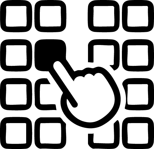
Flow 01
Frictionless Exploration Layer
Users can explore schedules and train options without creating an account.
Design Decisions
Authentication decoupled from browsing experience
Reduced cognitive load during early decision-making
Progressive disclosure of login only at conversion point
Flow 02
End-to-End Booking Flow
Ticket selection, seat allocation, and meal planning are combined into a single continuous flow.
Design Decisions
Single-session booking model to reduce context switching
Integrated decision-making (ticket + seat + meal)
Sequential dependency design (route → seat → meal)
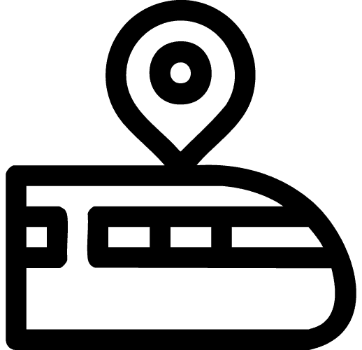
Flow 03
Live Journey Transparency
During travel, passengers often lack a clear sense of progress beyond static updates.
Design Decisions
Continuous real-time geospatial tracking
Dynamic ETA recalculation based on live system data
Shareable journey state for external coordination
Flow 04
Verified Support Continuity
When issues arise, users are often forced to restart context every time they reach support.
Design Decisions
Context-aware initialization (preloaded booking metadata)
Intent-based quick reply system for common queries
Human-in-the-loop escalation model (AI triage → agent handoff)
Task Completion
9/10 tasks
90% success
Most participants completed booking with meal planning and seat selection without assistance.
Efficiency Gain
3 min 40 sec
22% faster
Users completed the full booking flow (meal + seat selection) noticeably faster than the older app.
Usability Perception
80
Good usability
System Usability Scale suggests users found the redesigned experience intuitive and fairly easy to learn.
Validate at scale
Six testers told us a story — but Deutsche Bahn has 5M+ monthly app users. With more time I'd run a quantitative diary study to confirm seat-selection abandonment is really the top funnel leak.
Design for the messy middle
We focused on the happy path. Real journeys involve delays, missed connections and replacement buses — that's where the app should shine, and where I'd invest the next sprint.
My contribution
I led the IA, owned the seat-selection and live-tracking flows end-to-end, and ran all six usability sessions. Two teammates owned booking & support; one led visual system.